Here are eight ways to leverage psychology to sell more online, with concrete examples you can implement instantly.
Three Ways To Get That Button Clicked
Optimizing the call to action has a huge impact on the conversion rate. An effective behavioral psychology strategy to increase clicks on the call to action is to use visual elements that make it stand out. This can be mainly done using three techniques:1. Use Vivid Colors
Using a yellow or a red button will stand out more than any other darker color. When people land on your website they will be naturally drawn to look at the bright color and understand in three seconds or less what they are supposed to do.
Source: Created by the author for the use of the Search Engine Journal
- Red creates a more aggressive color contrast to the background of the page and therefore stands out more
- Red increases the heart rate and therefore it is more likely to trigger the need to take action
- Red is the ‘on sale’ color and therefore it is associated with getting a good deal
2. Use Visual Aids
Instead of simply letting the call to action button sit there, point it out. According to behavioral psychologists, it is more intuitive to click on a button if one is clearly supposed to. By placing something close to the button, the button itself is subconsciously perceived as less isolated, meaning it is not such a stretch to actually go ahead and click it.Examples of good visual aids are:
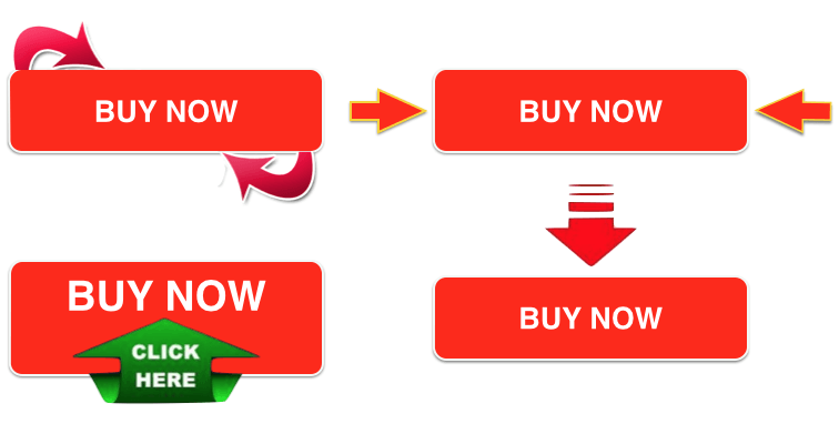
Source: Created by the author for the use of the Search Engine Journal
3. People Need to Look at the Call to Action
Whenever there are photos of people on the landing page, viewers are instantly drawn to the point the people in the photo are looking at. Therefore, the best photos are the ones that look at the call to action button.A common problem with that is that viewers skip other content and look directly at the photos. In order to avoid that, place photos on the side where people start reading. If potential clients read from left to right, the photo should be on the left. If they read from right to left, the photos should be on the right.
Make It Feel Like A Deal
Behavioral psychology has proven the way the price is presented dramatically changes the conversion rate of landing pages. A good pricing technique is offering alternative solutions to your pricing that are not actually meant to sell but are only there to make whatever you want to sell look like a deal.For instance, let’s imagine you sell a subscription service and have the following pricing:
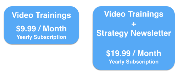
Source: Created by the author for the use of the Search Engine Journal

Source: Created by the author for the use of the Search Engine Journal
Upsell Before The Checkout
You should take advantage of the fact that people decided to purchase from your website. You managed to break down the barrier between your product/service and the customer. Psychologically, people tend to say yes to something new when they already agreed to something else before. Therefore it will be easier to upsell to the same customer than finding new ones.Note: it is the timing of the upsell that seals the deal because the momentum has passed after the checkout and upselling is therefore easiest just before the end of the checkout process.
Effective up-selling strategies are:
- “Customers who ordered this item also bought:”
- “Add product xyz and get free shipping”
- “Add product xyz to get a one time discount of X%”
1. First Two Upsells: Above the Fold
This amounts to a total upsell value of €13.55.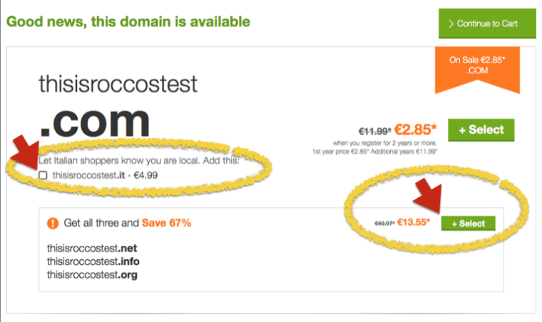
Source: Screenshot of Godaddy.com
2. 94 Upsells: Below The Fold
They also include premium accounts for a total value exceeding €10,000. Go Daddy does a great job at pressuring customers in protecting their own name and buying extra domains to feel safer.
3. Move to Page Two and Get an Upsell Above the Fold
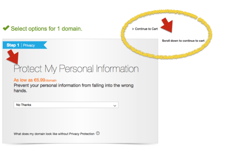
Source: Screenshot of Godaddy.com
4. Include Two More Upsells on the Final Checkout Page
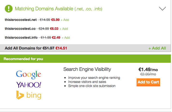
Source: Screenshot of Godaddy.com
Create a Sense Of Urgency
The more time sensitive your promotion is, the more likely people take action. Creating a sense of urgency quickens the decision-making process even if they are not sure whether the promotion will really expire.There are several ways to create a sense of urgency:
- Limited availability
- Having a countdown on the website saying when the promotion is going to end
- Upcoming price increase
- Helping readers understand the importance of receiving a piece of information sooner rather than later
Take Advantage Of The Power Of The Word ‘FREE’
You might have heard about the behavioral psychology experiment run by Duke University’s Dan Ariely. Two types of chocolate were put on display at the counter: Hershey kisses for 1 cent and Lindt chocolate truffles for 15 cents. Customers were informed that both chocolates were on discount resulting in the just mentioned prices and that they could have either one or the other. 70% bought Lindt even when the price was increased by 1 cent for each of the chocolates.However, when the Hershey kisses were offered for free and the Lindt truffles at 14 cents, meaning both were lowered by 1 cent from the initial price, 69% of customers chose the free Hershey kisses.
This test has proven that FREE is sexy and that anytime something is free, people will most likely give it a shot instead of paying for something that is actually the better deal.
If the goal is that people use/read/test something, give it away for free and offer something paid at the same time to increase the feeling of getting away with a freebie.
Give User The Option To Learn More About An Upsell
If you are not a fan of aggressive up-selling, simply offer the option to learn more about an additional product or service during the checkout process.For instance, you could have a checkbox at the bottom of your checkout button saying “Yes, I want to learn more about how to save 30% on my next purchase”. If people check the box, the offer page opens and they are more receptive to it because of the psychological effect discussed earlier: if someone agrees to someone once, it is more likely that he/she says yes again right after.
An example of a checkout page using this technique would look like the following:
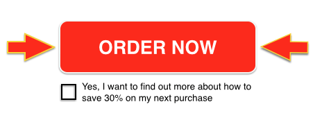
Source: Created by the author for the use of the Search Engine Journal
Watch The Way You Speak!
Write content as if readers have already decided to go through with the purchase. For instance, replace phrases mentioning “if you buy” with “when you will be using”, “the advantage of our product” with “You will love our product right from the first time you use it” . All scenarios should use phrases that imply the readers are already sure about buying the product.This concept also applies to live demos and videos. You need to make users feel as if they already own the product and conversion rates will increase.
Leverage On The Sense Of Belonging
Researchers at the University of California proved that social pressure and a sense of belonging can determine behavior. They randomly assigned one of two cards to several guest rooms. One card had a standard environmentally friendly message and the other stated that x% of hotel guests reused their towels.On average, people staying in the rooms with the cards with the percentage reused their towels 25% more than people with the environmentally friendly card.
Based on the results of this study, there are countless options to boost conversion rates. For instance, showcase your most popular package saying how many people prefer it to another solution. People will immediately identify with that and be more likely to complete a purchase. Another example could be upselling an item saying “80% of customers who bought this product also purchased…”.
Conclusion
In order to master behavioral psychology and significantly boost online sales, it is not enough to implement strategies once and never optimize them again. A common mistake is to make a button red and let it sit there. Seemingly insignificant details like the shade of red for the call to action button can make a difference and should be split tested to maximize the effects of behavioral psychology.Souces : http://www.searchenginejournal.com/8-ways-sell-online-behavioral-psychology/123921/

No comments:
Post a Comment